
Santa Ana Zoo
April 22nd 2024- 4 week sprint
Team - UX Researcher, UI/UX Designer, me
My Role - UI/UX Designer, Researcher


The Challenge
Santa Ana Zoo website was designed to assist families in buying tickets and enriching education. We have observed that users are frustrated by the lack of ticket purchases and unclear hierarchy.
The Outcome
How might ZooPals provide families with the proper tools to purchase zoo tickets effectively, have access to relevant information, and explore zoo guidelines and policies?
HEURISTICS ANALYSIS

- No ability to buy tickets online
- Lots of dense text makes it hard to parse


User persona centered around a family oriented mother who cares education.

“the biggest goal of this new website is to make it easy for people to find the information they need in one or two clicks…” -Zoo Manager
He also said the main topics of interest are ticket sales, events, education, and conservation.
We asked questions about website usage, user habits, and ticketing and membership. Additionally, I went to the Santa Ana Zoo to conduct interviews there.
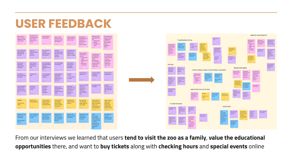
Front and center was families. 90% of zoo-goers were families.A majority of them checked the zoo website before going, and they would like the ability to buy tickets, check hours, and view special events online.
It was cool to see how the Zoo Director’s website goals aligned with user needs, so we had a clear direction that we wanted to take in our redesign project.
PROTOTYPING


Paper Prototypes
Keeping families and our main user flow of purchasing tickets in mind.

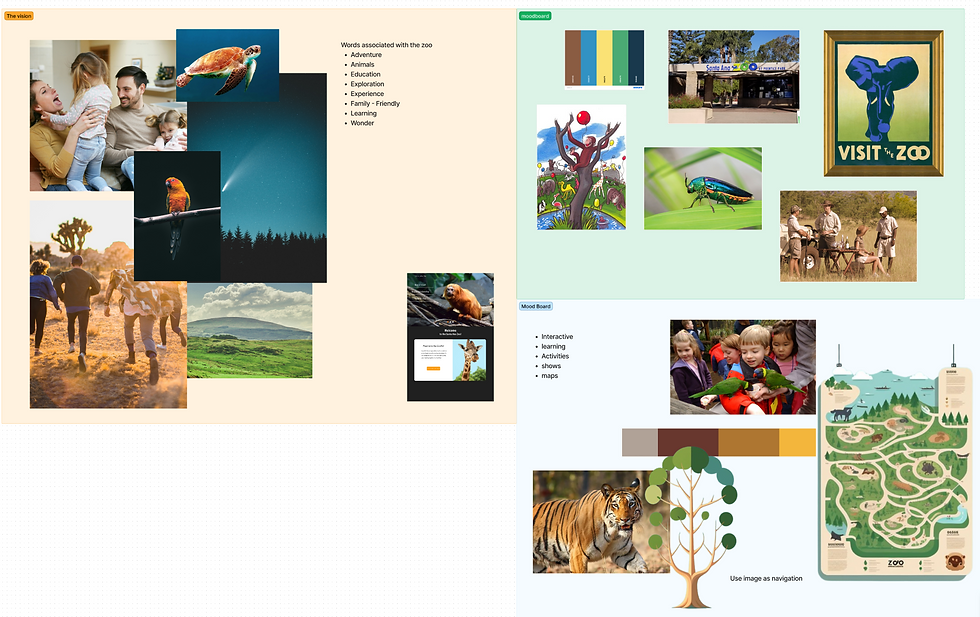
Moodboard
Main ideas we kept in mind:
- Family Friendly
- Educational
- Exploration & Fun

Changes made :
- Increased contrast for membership options. (top left)
- increased consistency in layout for tile design for articles and events. (bottom left)
- Took away time choice for selecting a ticket since we realized time wasn't needed for purchasing a ticket. Also increased consistency for tiles on the homepage. (right side)

What does our user flow look like at each step?

ITERATIONS

The old website was inconsistent, 2 different types of cards were created to use throughout the site to increase consistency.
Bringing it Full Circle
Keeping our main goals in mind
It was difficult to focus on one thing, the new website has one clear button to buy tickets.


A new user flow added to purchase tickets based on user responses & feedback from the Zoo manager.
Some users don't want to interact with people, so a mobile version of the website was also created to allow users to order tickets and scan in at the gate.


RESPONSIVE WEB DESIGN
- Outdated icons
- Unclear hierarchy
- False buttons
- Don't know what to focus on

- Different font sizes for body text
- Difficult to know what text corresponds to the image
